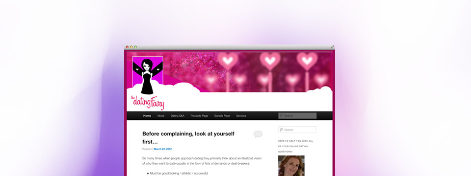
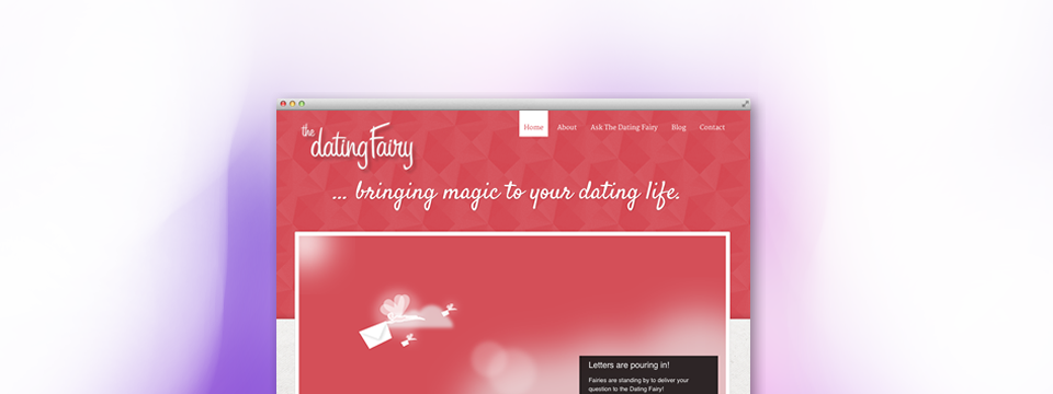
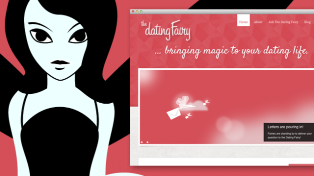
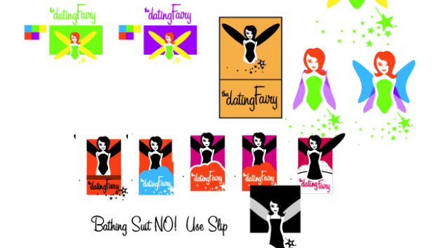
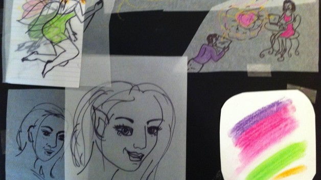
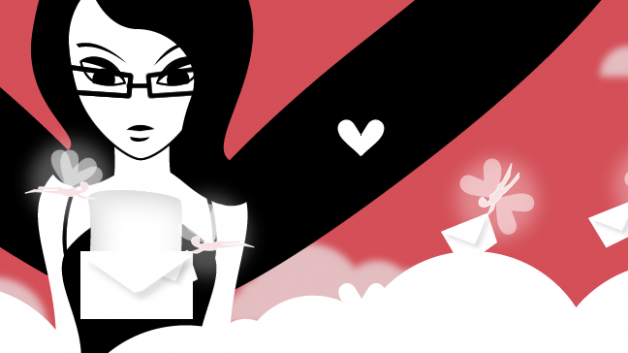
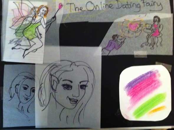
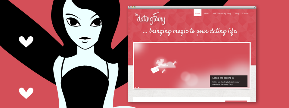
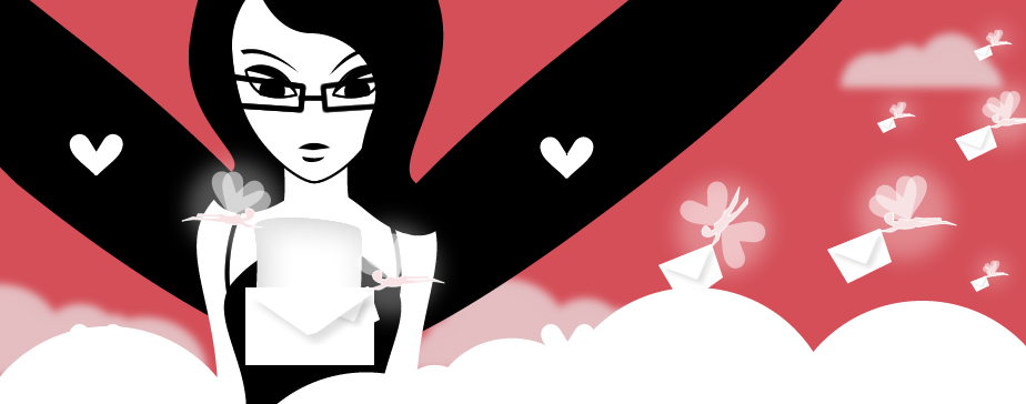
We began designing the logo from a really nice moodboard with initial ideas from the business owner, Una Drake.
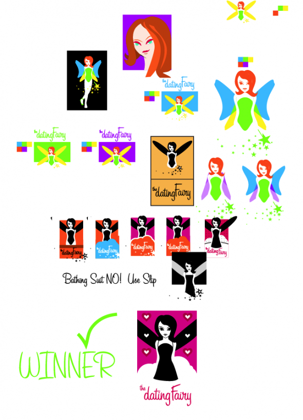
I loved the whimsy, but challenged the color decisions. The client confessed to being a pink-addict, but worried it would alienate male audiences. Naturally, during the conversation, some concepts began to emerge. We labeled our favorites and tabled the meeting. Next week we would meet again and finish the site and ID in a single session.
A gender challenge
Well, it was a bit girly at first, but with delicate focus on certain aspects of the logo character, I was able to assure a certain male draw by appealing to attraction in the abstract. We just made the fairy smoulder ever so slightly, and that seems to do the trick. Girls see it as girly, and guys see it as the promise of romance. There’s still problems addressing gender outliers and people who don’t fall so easily into the sexual identity box. We are moving forward keeping our eyes open for ways to close that gap.
Pretty quick from this point.
After we got a leading logo, it was a snap to explore this fairy’s hidden realm and to pull out some illustrative ideas.
I kept these in the back of my mind while we looked at ready-to-go themes on themeforest.net.
We found one that we liked and I encouraged a quick decision to ensure we kept our momentum. I really like that about these contained projects, if you have one day to get er did, you don’t waste time on indecision. We found a theme that came really close to our ideal tone right out of the box. Once we added in our own illustrations and icons, it looked better on our site than the preview did!
The client went from an idea, to a vibrant online business with a few day’s work and has been super pleased wit the results ever since!
A week Later
I received this lovely commentary from the client that I’d like to share.

The Client’s Reaction
Working with Joe was a joy and a pleasure! He was able to take the logo in a direction I never would have thought of, but am very happy with. I am thrilled with how fast the website came together, and how great it looks. Joe went above and beyond in quickly tweaking the original ‘Dating Fairy’ logo to create different expressions useful in various places, and also in creating a whole series of icons for use throughout the site and on our Facebook page, twitter account, etc., making it easy to look unified and professional. Previous to this project I had a little WordPress experience, but Joe’s encouraging coaching vastly increased my confidence and competence in utilizing the features on my own…”Look Ma–no hands!”. Thanks Joe! :-)
– Una Drake (The Dating Fairy)
So what’s in a professional Identity package?
About a hundred files were produced for Una to use. I’ve included a quick brand-guide for future designers which serves as a simple, universal, logo hand-off document. This PDF is the real value since it contains your vector logos and guides for using them. With this one PDF, you can actually do everything you need. Still, I went the extra mile and included PDF, AI, EPS, PNG, JPG, GIF, files for 6 sizes, and four different logo configurations as well as square icon-treatments for social websites. This comes out to a fairly big kit with hundreds of graphics for the client to use anywhere online. While I *CAN* just design a logo for you – I prefer to really give you all the keys to drive your new image yourself. Click the button below to download this identity kit and take a look for yourself.
Download the Dating Fairy Identity Guide.

