Segmenting
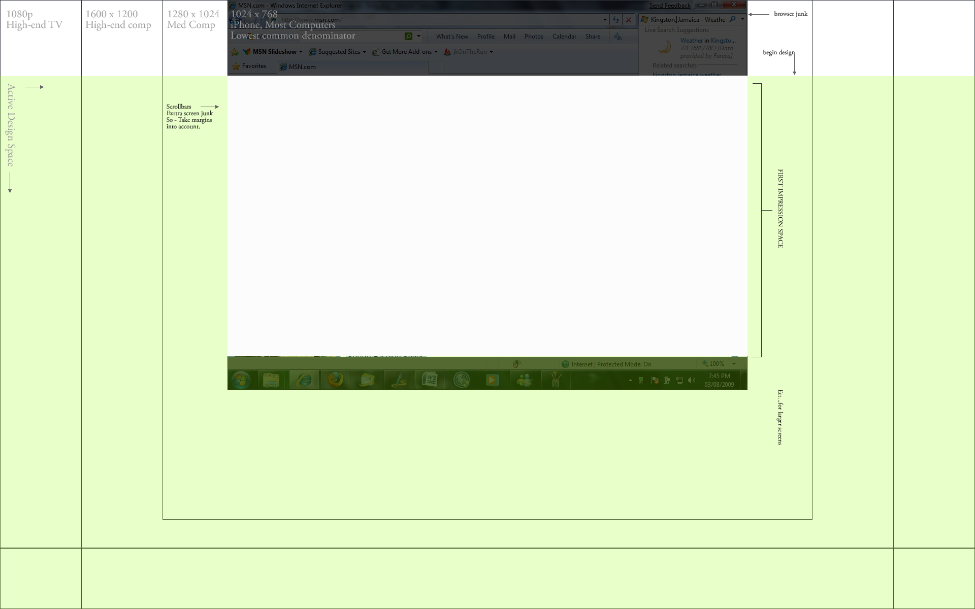
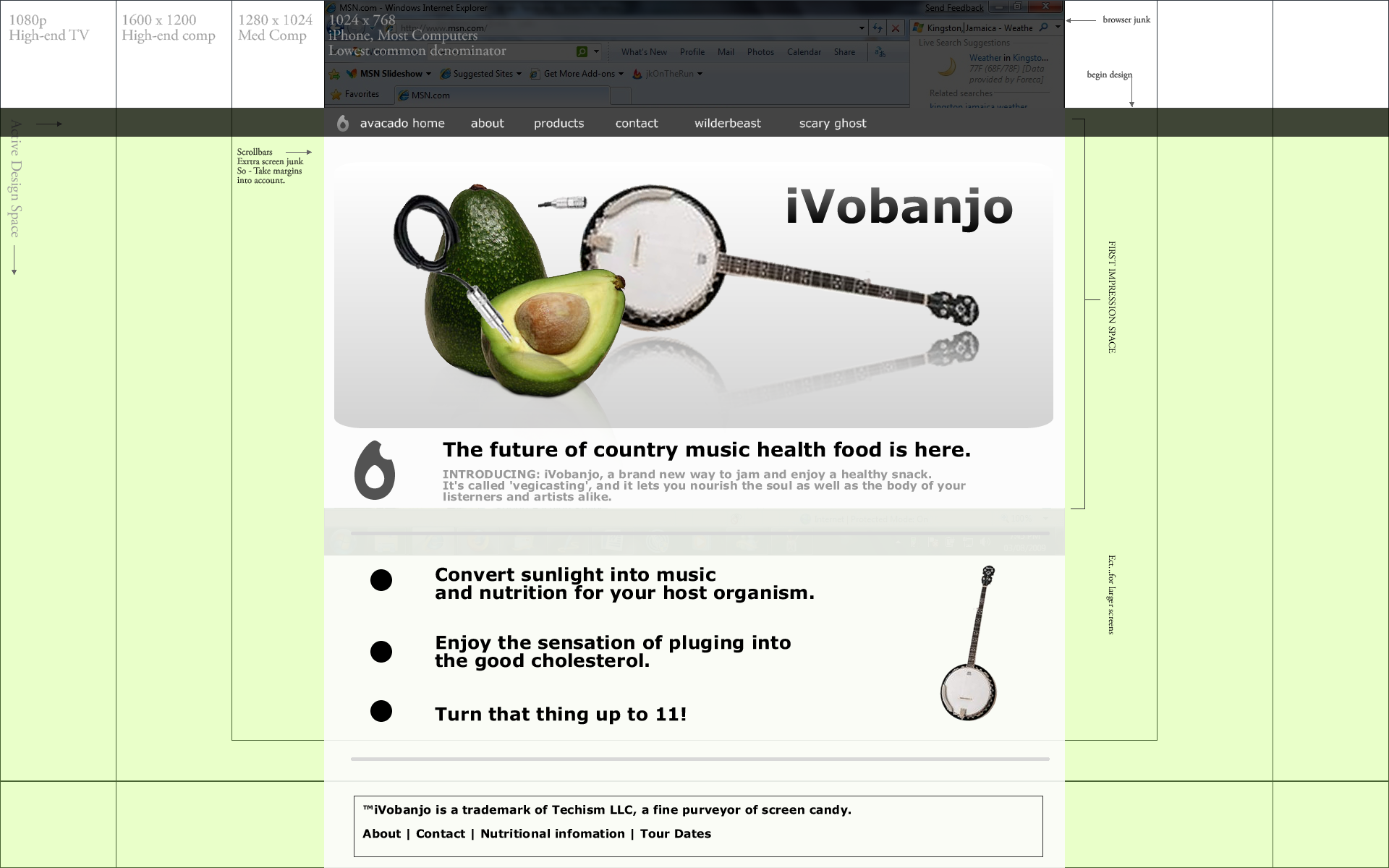
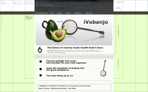
The images below are a pixel-accurate view of the spaces web designers consider when they segment designs. We segment them so that the first impression is complete at a glance for our ‘least common denominator’ (the lowest supported resolution) but also takes into account a balanced look on larger screens. Typically, the contemporary trend is to set a fixed-width for the page matching the width of your least common denominator, and all critical content should stay in that width. Horizontal segments then flow down the screen segmented at the termination points of common screen resolutions. Depending on the target market’s technological sophistication these points may be different. In this example, I chose the common practice of supporting 1024 x 768 as the most common low-resolution setting in the general public. I then added some segments for the next common size up, and have the footer still on screen for our 1080p users. However a design can be bottomless.
Bottomless? Does that mean scroll bars?
People are used to scroll bars now. The more content on the home page, and links to news articles, blog posts, promotional pages, features and other highlighted content that we present the better. This gives google and other information centered services lots of hooks to our content and pages. Maximum connectivity of content means maximum web presence and information propagation. This is also an easy format to update and control.
Now for some examples
Obviously this is a fake design and not intended as a hard guide for your own work which probably diverges creatively (and in good ways) from a lot of web trends. However usability wise, we should recognize how the amorphous shape of the web browser will re-crop our work constantly, and so we should design from that awareness. I hope this example helps underscore some of what we discussed as we move forward to better alignment of the existing designs and a fun user experience for your customers.
The three attached images attached show:
1. How the browser space can change between devices. (Click to Enlarge)
2. How a design can be overlaid on the format-logic of multiple devices.
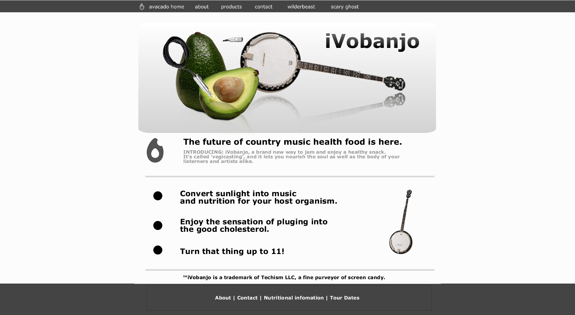
3. An isolated design shown at maximum supported resolution.

